nu3 – rebrand identity
nu3 – rebrand identity
Project
rebrand identity
brand & illustration system
Client
nu3
date
2024
role
creative strategy, brand identity
brand & illustration system

color & typography
A brand in balance. Where science, nature and human well-being converge.
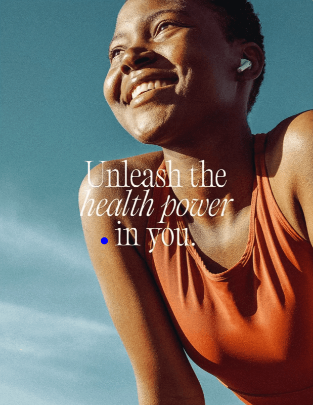
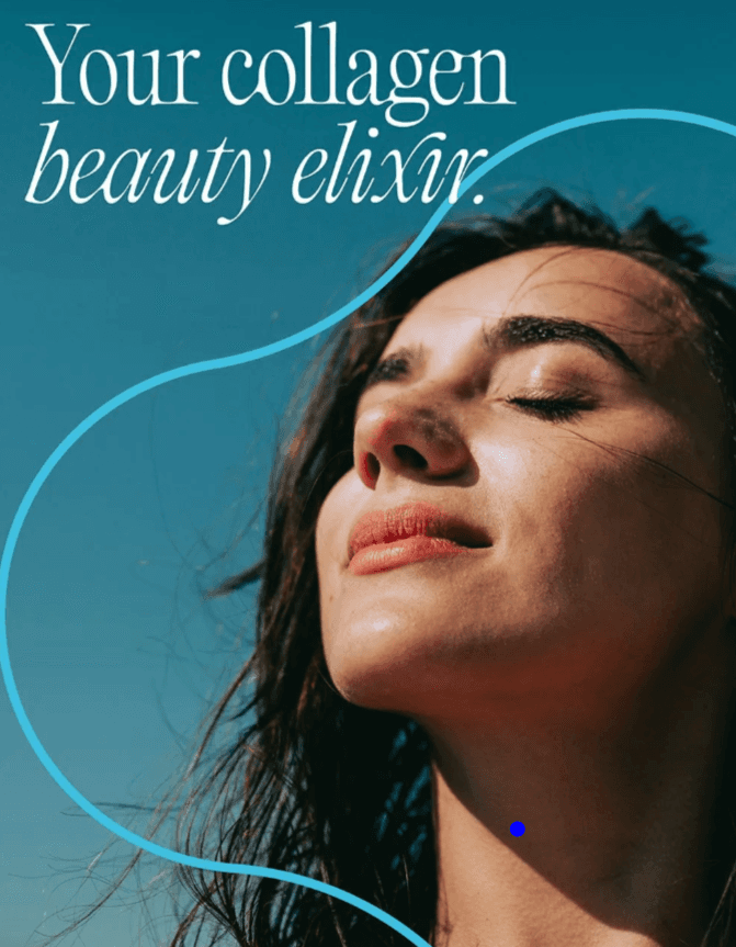
nu3, a subsidiary of Redcare®, leads in nutritional supplements, uniting sports, food, and health. To refine its identity while preserving its essence, we crafted a strategic visual language. Introducing a defined TOV, a new colour system, refining typography and creating a unifying conceptual form.
A brand in balance. Where science, nature and human well-being converge.
nu3, a subsidiary of Redcare®, leads in nutritional supplements, uniting sports, food, and health. To refine its identity while preserving its essence, we crafted a strategic visual language. Introducing a defined TOV, a new colour system, refining typography and creating a unifying conceptual form.
A brand in balance. Where science, nature and human well-being converge.
nu3, a subsidiary of Redcare®, leads in nutritional supplements, uniting sports, food, and health. To refine its identity while preserving its essence, we crafted a strategic visual language. Introducing a defined TOV, a new colour system, refining typography and creating a unifying conceptual form.

typography and color
Heritage and harmony. Where timeless typography meets the fluidity of form.
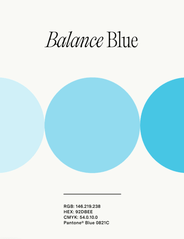
At the heart of the new identity is PP Editorial Old, a typeface inspired by classic pharmaceutical and herbalist design, balancing tradition with modernity to convey trust and craftsmanship. The streamlined colour palette defines Sport, Food, and Health, with a bold yellow as the corporate hue for energy and optimism.
Heritage and harmony. Where timeless typography meets the fluidity of form.
At the heart of the new identity is PP Editorial Old, a typeface inspired by classic pharmaceutical and herbalist design, balancing tradition with modernity to convey trust and craftsmanship. The streamlined colour palette defines Sport, Food, and Health, with a bold yellow as the corporate hue for energy and optimism.
Heritage and harmony. Where timeless typography meets the fluidity of form.
At the heart of the new identity is PP Editorial Old, a typeface inspired by classic pharmaceutical and herbalist design, balancing tradition with modernity to convey trust and craftsmanship. The streamlined colour palette defines Sport, Food, and Health, with a bold yellow as the corporate hue for energy and optimism.


photography style
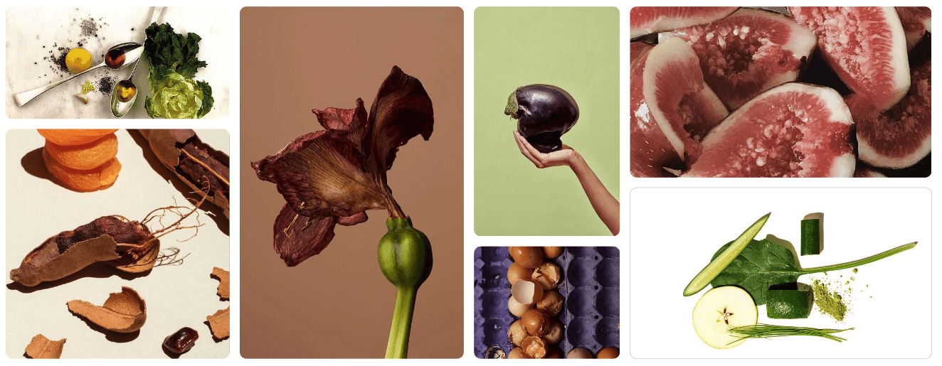
Our photography style is organic, dynamic, and empathetic. It is a source of inspiration, encouraging action and well-being.
When the photograph centers solely on the ingredients and product, we want to show the pure essence of naturality. To do so, the key is “controlled messy”. Let’s show the ingredients as they are in nature, with their flaws and imperfections. Beautiful compositions that seems casual.
Our photography style is organic, dynamic, and empathetic. It is a source of inspiration, encouraging action and well-being.
When the photograph centers solely on the ingredients and product, we want to show the pure essence of naturality. To do so, the key is “controlled messy”. Let’s show the ingredients as they are in nature, with their flaws and imperfections. Beautiful compositions that seems casual.
Our photography style is organic, dynamic, and empathetic. It is a source of inspiration, encouraging action and well-being.
When the photograph centers solely on the ingredients and product, we want to show the pure essence of naturality. To do so, the key is “controlled messy”. Let’s show the ingredients as they are in nature, with their flaws and imperfections. Beautiful compositions that seems casual.


brand anchor: tricle
The Tricle was born from the union of two geometric shapes that are very dear to us and that we associate with fundamental aspects of nu3’s mission.
The Triangle of Health has always been our priority, as it represents the perfect combination of physical and mental well- being, along with the well-being that comes from social interaction. On the other hand, it was important for us to also express how significant the community is to us.
The fusion of these two worlds led to the creation
of a graphic symbol that contains three circles arranged in a radial pattern, forming a triangle.
The Tricle was born from the union of two geometric shapes that are very dear to us and that we associate with fundamental aspects of nu3’s mission.
The Triangle of Health has always been our priority, as it represents the perfect combination of physical and mental well- being, along with the well-being that comes from social interaction. On the other hand, it was important for us to also express how significant the community is to us.
The fusion of these two worlds led to the creation
of a graphic symbol that contains three circles arranged in a radial pattern, forming a triangle.
The Tricle was born from the union of two geometric shapes that are very dear to us and that we associate with fundamental aspects of nu3’s mission.
The Triangle of Health has always been our priority, as it represents the perfect combination of physical and mental well- being, along with the well-being that comes from social interaction. On the other hand, it was important for us to also express how significant the community is to us.
The fusion of these two worlds led to the creation
of a graphic symbol that contains three circles arranged in a radial pattern, forming a triangle.


process & solution
A shift in identity. Beyond rebranding, a bold recalibration for a future-facing brand.
This strategic reimagination of nu3 goes beyond a simple rebrand; it represents a recalibration of identity. By seamlessly integrating form, colour, and imagery, we have crafted a bold, contemporary visual language combined with a redefined, dynamic TOV to make nu3 unmistakable and inimitable.
nu3 now stands as a pioneering force in the industry, with a cohesive and visionary brand presence across both digital and physical spaces.
A shift in identity. Beyond rebranding, a bold recalibration for a future-facing brand.
This strategic reimagination of nu3 goes beyond a simple rebrand; it represents a recalibration of identity. By seamlessly integrating form, colour, and imagery, we have crafted a bold, contemporary visual language combined with a redefined, dynamic TOV to make nu3 unmistakable and inimitable.
nu3 now stands as a pioneering force in the industry, with a cohesive and visionary brand presence across both digital and physical spaces.
A shift in identity. Beyond rebranding, a bold recalibration for a future-facing brand.
This strategic reimagination of nu3 goes beyond a simple rebrand; it represents a recalibration of identity. By seamlessly integrating form, colour, and imagery, we have crafted a bold, contemporary visual language combined with a redefined, dynamic TOV to make nu3 unmistakable and inimitable.
nu3 now stands as a pioneering force in the industry, with a cohesive and visionary brand presence across both digital and physical spaces.




Want to work TOGETHER on your next project? I’d love to hear from you.
BRANDING. ART DIRECTION. GRAPHIC. ILLUSTRATION. PRODUCTION.
BRANDING. ART DIRECTION. GRAPHIC. ILLUSTRATION. PRODUCTION.
BRANDING. ART DIRECTION. GRAPHIC. ILLUSTRATION. PRODUCTION.
BRANDING. ART DIRECTION. GRAPHIC. ILLUSTRATION. PRODUCTION.
BRANDING. ART DIRECTION. GRAPHIC. ILLUSTRATION. PRODUCTION.
BRANDING. ART DIRECTION. GRAPHIC. ILLUSTRATION. PRODUCTION.
BRANDING. ART DIRECTION. GRAPHIC. ILLUSTRATION. PRODUCTION.
© 2026 NYKIE NGAN All Rights Reserved
Want to work TOGETHER on your next project? I’d love to hear from you.
BRANDING. ART DIRECTION. GRAPHIC. ILLUSTRATION. PRODUCTION.
BRANDING. ART DIRECTION. GRAPHIC. ILLUSTRATION. PRODUCTION.
BRANDING. ART DIRECTION. GRAPHIC. ILLUSTRATION. PRODUCTION.
BRANDING. ART DIRECTION. GRAPHIC. ILLUSTRATION. PRODUCTION.
BRANDING. ART DIRECTION. GRAPHIC. ILLUSTRATION. PRODUCTION.
BRANDING. ART DIRECTION. GRAPHIC. ILLUSTRATION. PRODUCTION.
BRANDING. ART DIRECTION. GRAPHIC. ILLUSTRATION. PRODUCTION.
© 2026 NYKIE NGAN All Rights Reserved
Want to work TOGETHER on your next project? I’d love to hear from you.
BRANDING. ART DIRECTION. GRAPHIC. ILLUSTRATION. PRODUCTION.
BRANDING. ART DIRECTION. GRAPHIC. ILLUSTRATION. PRODUCTION.
BRANDING. ART DIRECTION. GRAPHIC. ILLUSTRATION. PRODUCTION.
BRANDING. ART DIRECTION. GRAPHIC. ILLUSTRATION. PRODUCTION.
BRANDING. ART DIRECTION. GRAPHIC. ILLUSTRATION. PRODUCTION.
BRANDING. ART DIRECTION. GRAPHIC. ILLUSTRATION. PRODUCTION.
BRANDING. ART DIRECTION. GRAPHIC. ILLUSTRATION. PRODUCTION.
© 2026 NYKIE NGAN All Rights Reserved
NU3 – BALANCE YOUR HEALTH CAMPAIGN